

“How is my hospital doing comparing to others?”
From a Director at Hospital X - 2025
HOW IT STARTS
One of our clients asked, "Can you help me compare my data with that of other hospitals?"
Of course our answer was: “Yes, we can!”
View NDA screens with password
Gather info
To clarify expectations and feasibility, I interviewed both the customers and internal stakeholders.
Customer wants to assess how effective a project is at improving healthcare in these hospitals.
Track performance trends over time.
“After a new project has been running, I need a way to assess its impact on all my hospitals.”
Highlight top performer and show average.
“It's important for us to quickly spot the top performer and how other hospitals compare to the average.”
Easily make & download a Report.
“We need to show the results in the meetings. I really need a way to quickly make a report.”
Internal stakeholders also mentioned several key points I need to consider before the design phase.
Data Team
- Can only compare metrics shared by all participating hospitals.
- Clear filters are needed to categorize the hospitals.
Clinical Team
- Only general filters can be used to prevent users from identifying the hospital they’re comparing.
- Hide all data if 3 or fewer hospitals remain, even if anonymous.
Product Team
- Treat it as an opportunity to test new product concepts.
- Save filters for easy access later.
- Need a way to compare overall and time-based performance.
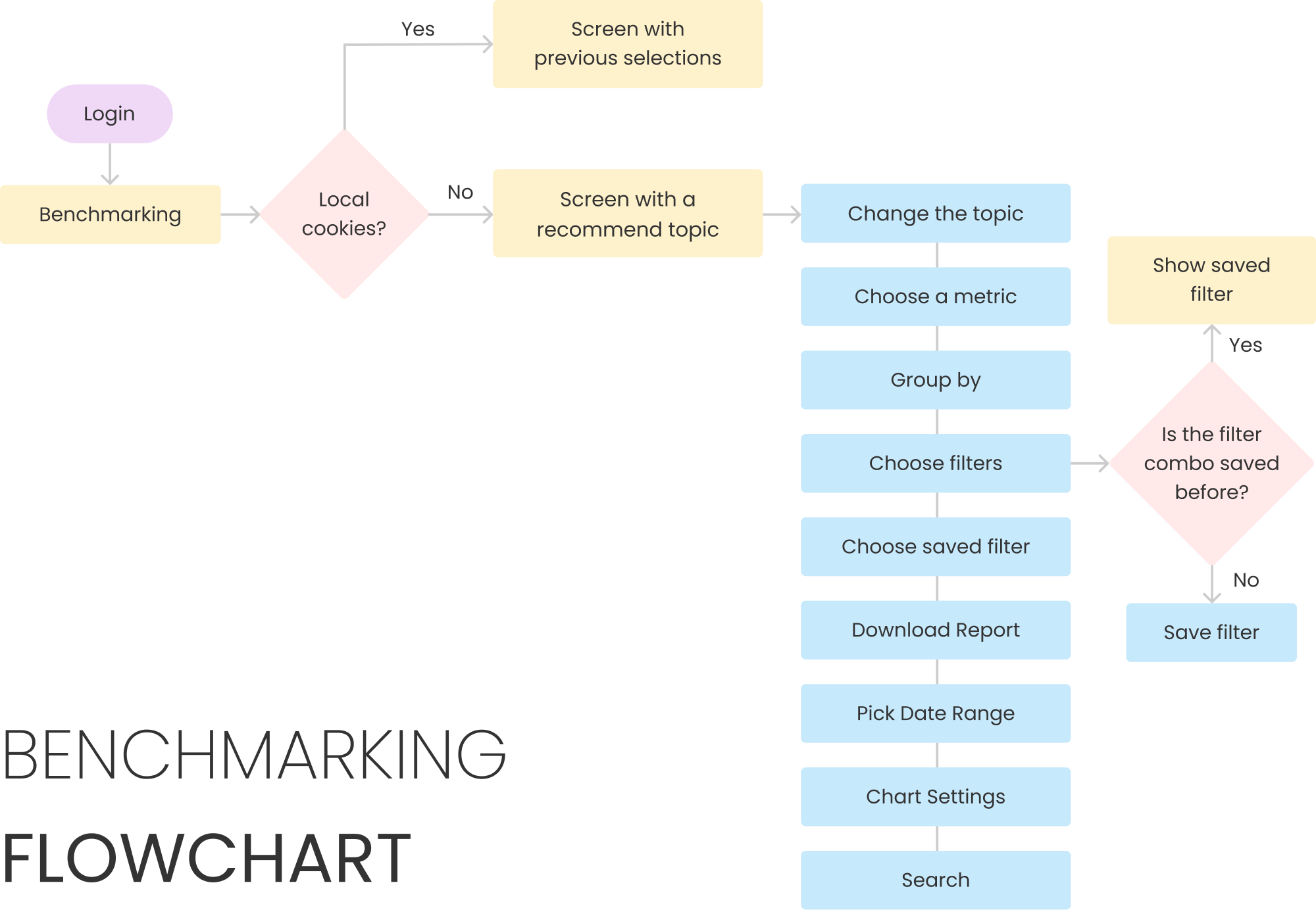
user flow
I used a flow chart to outline the key paths and align with customers and stakeholders.
Solutions
Fewer Clicks for Faster Insights
Before
Topics appear on screen at once, creating clutter.

After
Smart topic selection based on your usage.
Auto-select the only topic
Auto select the most used topic
Only have 1 topic?


Yes
No
Topic
Obstetrics


Before
Repeatedly opening a metric modal is inefficient.
Metric Group 1


Metric Group 2
Metric Group 3
Metric Name
Metric Name
Metric Name
Metric Name
Metric Name

save
After
Select sidebar metrics to instantly view chart.
Metrics
Obstetric Metric Group #1
Obstetric Metric Group #2
NTSV Rate
Metric #2
Metric #3
Metric #4
Obstetric Metric Group #3


Save Filters to Save Time
Limit filters to simplify selection and prevent guessing anonymous data.
Saved Filters


Filter Name 1
Filter Name 2

All Types


Type A
Type B
Type C
Prompt to save when a new filter combination is detected.
Saved Filters


Type A
Group B
SAVE filter
Offer option to update saved filter or save as new.
Filter saved on 3/11 (Modified)


Type A
Group C
SAVE filter
Update Existing Filter
Save As New Filter
Switch filters and efficiently download multiple metric graphs at once.
Metric Group 1
Metric Group 2


Choose Metrics to Download


Lorem ipsum dolor sit amet, consectetur adipiscing
Metric name consectetur adipiscing

Metric name #3
Metric name Lorem ipsum dolor sit amet
Metric name here with increased extended length
Lorem ipsum dolor sit amet, consectetur adipiscing
Lorem ipsum dolor adipiscing
Metric name medium length


DOWNLOAD
2 metrics selected
Pick the Right Chart, See More
The funnel chart offers a quick overall comparison between the user and others.
Percent


0
1
2
3
4
5
6

Mean: 3.1%
Low Volume (Left) to High Volume (Right)


Best Facility

My Facility

Others
My Facility
2.3%
n=114
3/12/2023 - 3/12/2025
Line charts show trends over time; X-bar charts monitor process averages over time.
Percent


5/1/2023
2/1/2024
8/1/2024
8/1/2023
5/1/2024
11/1/2023
11/1/2024
02/1/2025

0
1
2
3
4
5
6

Mean: 3.1%, ±5SD


Best Facility

My Facility

Others
Challenge
Customer wants to see hospital trends over time, but showing a line for each hospital would be messy and hard to read.
Percent


5/1/2024
5/10/2024
5/16/2024
5/4/2024
5/13/2024
5/7/2024
5/19/2024
02/01/2025


0
1
2
3
4
5
6

Mean: 3.1%
Further interviews revealed that what customers actually care about is how they compare to the average and the best.
So, I used an X-bar chart to show average ranges over time, clearly conveying the information customers need.
Percent


5/1/2023
2/1/2024
8/1/2024
8/1/2023
5/1/2024
11/1/2023
11/1/2024
02/1/2025

0
1
2
3
4
5
6

Mean: 3.1%, ±5SD


Best Facility

My Facility

Others
RESULTS
The launch received positive feedback and led to higher sales and contract renewal rates.
66%

of hesitant customers signed contract
70%

customers with this feature renew their contracts
32%
in Monthly Active Users
35%

in session length
29%
in 30D retention
Retro
1. What users think they want to see may not reflect what they truly need—focus on asking more WHYs than WHATs.
2. For our customers, efficiently viewing data and trends without extensive prior selections is crucial.

Check out more projects

Making City Exploration Inclusive for Blind Users
Won top prize “People’s Choice” at HCDE Open House for an exploration app designed for low-vision users.
View More →

Boosting User Retention and Revenue for a Game
Defined product strategy alongside the PM, resulting in a 113% growth in ARPDAU and a 28% in D1 retention
View More →
Enhanced Engagement and Reduced Drop-off Rate
Redesigned onboarding UX and drove a 73% boost in weekly active users and cut D1 drop-off by 68%.
View More →

“How is my hospital doing comparing to others?”
From a Director at Hospital X - 2025
HOW IT STARTS
One of our clients asked, "Can you help me compare my data with that of other hospitals?"
As a company that supports numerous hospital systems in analyzing their data, we can access and compare their metrics while ensuring all data remains anonymous.
Of course our answer was: “Yes, we can!”
View NDA screens with password
Gather info
To clarify expectations and feasibility, I interviewed both the customers and internal stakeholders.
I need to understand when and why customer will use this tool and what insights they aim to gain from the comparison.
Internal stakeholders will also provide input on any design constraints we need to consider.
Customer wants to assess how effective a project is at improving healthcare in these hospitals.
Track performance trends over time.
“After a new project has been running, I need a way to assess its impact on all my hospitals.”
Highlight top performer and show average.
“It's important for us to quickly spot the top performer and how other hospitals compare to the average.”
Easily make & download a Report.
“We need to show the results in the meetings. I really need a way to quickly make a report.”
Internal stakeholders also mentioned several key points I need to consider before the design phase.
Data Team
- Can only compare metrics shared by all participating hospitals.
- Clear filters are needed to categorize the hospitals.
Clinical Team
- Only general filters can be used to prevent users from identifying the hospital they’re comparing.
- Hide all data if 3 or fewer hospitals remain, even if anonymous.
Product Team
- Treat it as an opportunity to test new product concepts.
- Save filters for easy access later.
- Need a way to compare overall and time-based performance.
SET GOAL
Business goals:
- Be the industry’s first to enable hospital comparisons.
- Drive contract renewals with this add-on feature.
- Convince potential customers to sign the contract.
Design goals:
- Allow quick data access with minimal actions.
- Support frequent users with streamlined access.
- Empower users to share results widely, enhancing our reputation.
user flow
I used a flow chart to outline the key paths and align with customers and stakeholders.
I also used this project to test the new user flow I created for our main product, streamlining the processes to better meet our persona's needs.
Solutions
Fewer Clicks for Faster Insights
Before
Topics appear on screen at once, creating clutter.

After
Smart topic selection based on your usage.
Auto-select the only topic
Auto select the most used topic
Only have 1 topic?


Yes
No
Topic


Before
Repeatedly opening a metric modal is inefficient.
Metric Group 1


Metric Group 2
Metric Group 3
Metric Name
Metric Name
Metric Name
Metric Name
Metric Name

save
After
Select sidebar metrics to instantly view chart.
Metrics
Obstetric Metric Group #1
Obstetric Metric Group #2
NTSV Rate
Metric #2
Metric #3
Metric #4
Obstetric Metric Group #3


Save Filters to Save Time
- Limit filters to simplify selection and prevent guessing anonymous data.
Saved Filters


Filter Name 1
Filter Name 2
Filter Name 3
Filter Name 4

All Types


Type A
Type B
Type C
- Prompt to save when a new filter combination is detected.
Saved Filters


Filter Name 1
Type A
Group B
Filter Name 4
SAVE filter
- Offer option to update saved filter or save as new.
Filter saved on 3/11 (Modified)


Project X
Type A
Group B
Filter Name 4
SAVE filter
Update Existing Filter
Save As New Filter
- Switch filters and efficiently download multiple metric graphs at once.
Metric Group 1
Metric Group 2


Choose Metrics to Download


Lorem ipsum dolor sit amet, consectetur adipiscing
Metric name consectetur adipiscing

Metric name #3
Metric name Lorem ipsum dolor sit amet
Metric name here with increased extended length
Lorem ipsum dolor sit amet, consectetur adipiscing
Lorem ipsum dolor adipiscing
Metric name medium length


DOWNLOAD
2 metrics selected
Pick the Right Chart to See More
The funnel chart offers a quick overall comparison between the user and others.
Percent


0
1
2
3
4
5
6

Mean: 3.1%
Low Volume (Left) to High Volume (Right)


Best Facility

My Facility

Others
My Facility
2.3%
n=114
3/12/2023 - 3/12/2025
Line charts show trends over time; X-bar charts monitor process averages over time.
Percent


5/1/2023
2/1/2024
8/1/2024
8/1/2023
5/1/2024
11/1/2023
11/1/2024
02/1/2025

0
1
2
3
4
5
6

Mean: 3.1%, ±5SD


Best Facility

My Facility

Others
Challenge
Customer wants to see hospital trends over time, but showing a line for each hospital would be messy and hard to read.
In the request gathering meeting, customers expressed interest in seeing how each hospital performs over time, but displaying all hospitals on one chart leads to the following:
Percent


5/1/2024
5/10/2024
5/16/2024
5/4/2024
5/13/2024
5/7/2024
5/19/2024
02/01/2025


0
1
2
3
4
5
6

Mean: 3.1%
Further interviews revealed that what customers actually care about is how they compare to the average and the best.
Customers mentioned that they want to know if they fall within the safe range compared to others, and also see how close they are to the best over time.
So, I used an X-bar chart to show average ranges over time, clearly conveying the information customers need.
Percent


5/1/2023
2/1/2024
8/1/2024
8/1/2023
5/1/2024
11/1/2023
11/1/2024
02/1/2025
0
1
2
3
4
5
6
Mean: 3.1%, ±5SD


Best Facility

My Facility

Others
RESULTS
The launch received positive feedback and led to higher sales and contract renewal rates.
66%

of hesitant customers signed contract
70%
customers with this feature renew their contracts
32%
in Monthly Active Users
35%
in session length
29%
in 30D retention
Retro
1. What users think they want to see may not reflect what they truly need—focus on asking more WHYs than WHATs.
Customers initially wanted detailed performance comparisons over time with other hospitals. However, further interviews revealed they only need to know if they're above or below the average for a given period.
2. For our customers, efficiently viewing data and trends without extensive prior selections is crucial.
This feature is designed for managers, enabling quick data display and selection boosts their confidence and satisfaction with our product.

Check out more projects
Making City Exploration Inclusive for Blind Users
Won top prize “People’s Choice” at HCDE Open House for an exploration app designed for low-vision users.
View More →
Boosting User Retention and Revenue for a Game
Defined product strategy alongside the PM, resulting in a 113% growth in ARPDAU and a 28% in D1 retention
View More →
Enhanced Engagement and Reduced Drop-off Rate
Redesigned onboarding UX and drove a 73% boost in weekly active users and cut D1 drop-off by 68%.
View More →

“How is my hospital doing comparing to others?”
From a Director at Hospital X - 2025
HOW IT STARTS
One of our clients asked, "Can you help me compare my data with that of other hospitals?"
As a company that supports numerous hospital systems in analyzing their data, we can access and compare their metrics while ensuring all data remains anonymous.
Of course our answer was: “Yes, we can!”
View NDA screens with password
Gather info
To clarify expectations and feasibility, I interviewed both the customers and internal stakeholders.
I need to understand when and why customer will use this tool and what insights they aim to gain from the comparison.
Internal stakeholders will also provide input on any design constraints we need to consider.
Customer wants to assess how effective a project is at improving healthcare in these hospitals.
Track performance trends over time.
“After a new project has been running, I need a way to assess its impact on all my hospitals.”
Highlight top performer and show average.
“It's important for us to quickly spot the top performer and how other hospitals compare to the average.”
Easily make & download a Report.
“We need to show the results in the meetings. I really need a way to quickly make a report.”
Internal stakeholders also mentioned several key points I need to consider before the design phase.
Data Team
- Can only compare metrics shared by all participating hospitals.
- Clear filters are needed to categorize the hospitals.
Clinical Team
- Only general filters can be used to prevent users from identifying the hospital they’re comparing.
- Hide all data if 3 or fewer hospitals remain, even if anonymous.
Product Team
- Treat it as an opportunity to test new product concepts.
- Save filters for easy access later.
- Need a way to compare overall and time-based performance.
SET GOAL
Business goals:
- Be the industry’s first to enable hospital comparisons.
- Drive contract renewals with this add-on feature.
- Convince potential customers to sign the contract.
Design goals:
- Allow quick data access with minimal actions.
- Support frequent users with streamlined access.
- Empower users to share results widely, enhancing our reputation.
user flow
I used a flow chart to outline the key paths and align with customers and stakeholders.
I also used this project to test the new user flow I created for our main product, streamlining the processes to better meet our persona's needs.
Solutions
Fewer Clicks for Faster Insights
Before
Topics appear on screen at once, creating clutter.

After
Smart topic selection based on your usage.
Auto-select the only topic
Auto select the most used topic
Only have 1 topic?


Yes
No
Topic
Obstetrics


Before
Repeatedly opening a metric modal is inefficient.
Metric Group 1


Metric Group 2
Metric Group 3
Metric Name
Metric Name
Metric Name
Metric Name
Metric Name

save
After
Select sidebar metrics to instantly view chart.
Metrics
Obstetric Metric Group #1
Obstetric Metric Group #2
NTSV Rate
Metric #2
Metric #3
Metric #4
Obstetric Metric Group #3


Save Filters to Save Time
- Limit filters to simplify selection and prevent guessing anonymous data.
Saved Filters


Filter Name 1
Filter Name 2
Filter Name 3
Filter Name 4

All Types


Type A
Type B
Type C
- Prompt to save when a new filter combination is detected.
Saved Filters
Filter Name 1
Type A
Group B
Filter Name 4
SAVE filter
- Offer option to update saved filter or save as new.
Filter saved on 3/11 (Modified)
Project X
Type A
Group B
Filter Name 4
SAVE filter
Update Existing Filter
Save As New Filter
- Switch filters and efficiently download multiple metric graphs at once.
Metric Group 1
Metric Group 2


Choose Metrics to Download


Lorem ipsum dolor sit amet, consectetur adipiscing
Metric name consectetur adipiscing

Metric name #3
Metric name Lorem ipsum dolor sit amet
Metric name here with increased extended length
Lorem ipsum dolor sit amet, consectetur adipiscing
Lorem ipsum dolor adipiscing
Metric name medium length


DOWNLOAD
2 metrics selected
Pick the Right Chart to See More
The funnel chart offers a quick overall comparison between the user and others.
Percent


0
1
2
3
4
5
6

Mean: 3.1%
Low Volume (Left) to High Volume (Right)


Best Facility

My Facility

Others
My Facility
2.3%
n=114
3/12/2023 - 3/12/2025
Line charts show trends over time; X-bar charts monitor process averages over time.
Percent


5/1/2023
2/1/2024
8/1/2024
8/1/2023
5/1/2024
11/1/2023
11/1/2024
02/1/2025

0
1
2
3
4
5
6

Mean: 3.1%, ±5SD


Best Facility

My Facility

Others
Challenge
Customer wants to see hospital trends over time, but showing a line for each hospital would be messy and hard to read.
In the request gathering meeting, customers expressed interest in seeing how each hospital performs over time, but displaying all hospitals on one chart leads to the following:
Percent
5/1/2024
5/10/2024
5/16/2024
5/4/2024
5/13/2024
5/7/2024
5/19/2024
02/01/2025


0
1
2
3
4
5
6
Mean: 3.1%
Further interviews revealed that what customers actually care about is how they compare to the average and the best.
Customers mentioned that they want to know if they fall within the safe range compared to others, and also see how close they are to the best over time.
So, I used an X-bar chart to show average ranges over time, clearly conveying the information customers need.
Percent


5/1/2023
2/1/2024
8/1/2024
8/1/2023
5/1/2024
11/1/2023
11/1/2024
02/1/2025
0
1
2
3
4
5
6
Mean: 3.1%, ±5SD
Best Facility
My Facility
Others
RESULTS
The launch received positive feedback and led to higher sales and contract renewal rates.
66%

of hesitant customers signed contract
70%
customers with this feature renew their contracts
32%
in Monthly Active Users
35%
in session length
29%
in 30D retention
Retro
1. What users think they want to see may not reflect what they truly need—focus on asking more WHYs than WHATs.
Customers initially wanted detailed performance comparisons over time with other hospitals. However, further interviews revealed they only need to know if they're above or below the average for a given period.
2. For our customers, efficiently viewing data and trends without extensive prior selections is crucial.
This feature is designed for managers, enabling quick data display and selection boosts their confidence and satisfaction with our product.

Check out more projects
Making City Exploration Inclusive for Blind Users
Won top prize “People’s Choice” at HCDE Open House for an exploration app designed for low-vision users.
View More →
Boosting User Retention and Revenue for a Game
Defined product strategy alongside the PM, resulting in a 113% growth in ARPDAU and a 28% in D1 retention
View More →
Enhanced Engagement and Reduced Drop-off Rate
Redesigned onboarding UX and drove a 73% boost in weekly active users and cut D1 drop-off by 68%.
View More →