

“Going to the same place over and over sucks.”
From a blind participant
HOW IT STARTS
Everyone deserves to explore the world — including those who are visually impaired.
RESEARCH
Use focus groups to uncover obstacles individuals face when exploring unfamiliar places.
We identified 3 key insights that could inform potential solutions within our scope.
“I’m afraid of getting lost in unfamiliar places”
Participants expressed concerns about unclear directions, unfamiliar traffic conditions, safety issues, and uncertainty about whether they have arrived.
“I’m not aware of the stores along my usual route”
Participants can’t quickly scan nearby stores as individuals with normal vision can, nor can they manually browse each store on a map while walking.
“I’m not sure if the new place is accessible for me”
Providing feedback that includes details on accessibility aspects is crucial, such as whether a location has a wheelchair ramp or has Braille menu.
Why do they still have these problems with existing technology?

To better engage users, I need to clearly define who they are and what they need.
The 2 main users types we target for this game are Achievers and Socializers.
Soundscape
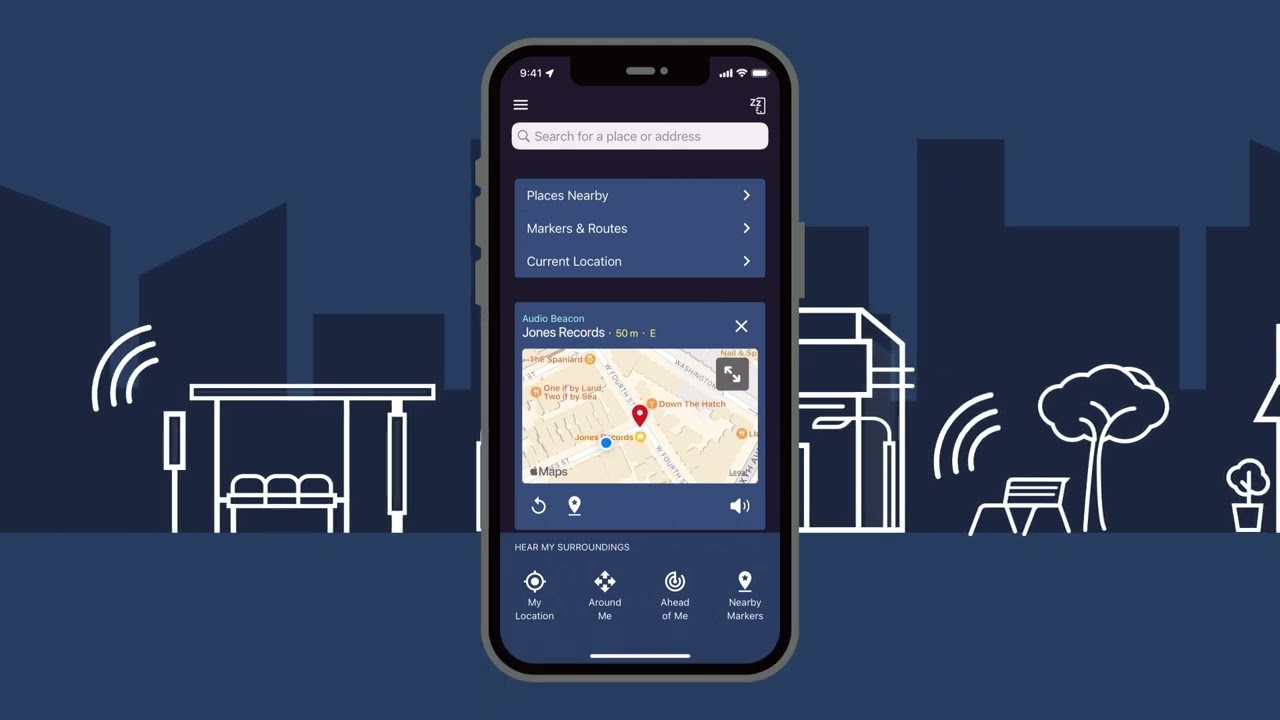
Strengths:
- Focus on navigation for the blind
- Provide vocalized information about nearby stores and places
- Create a 3D sound map for use with headphones
Our Opportunities:
- Connect people with visual impairments to the broader public
- Update the app's design for a more modern look
- Collect and analyze user preferences
Yelp
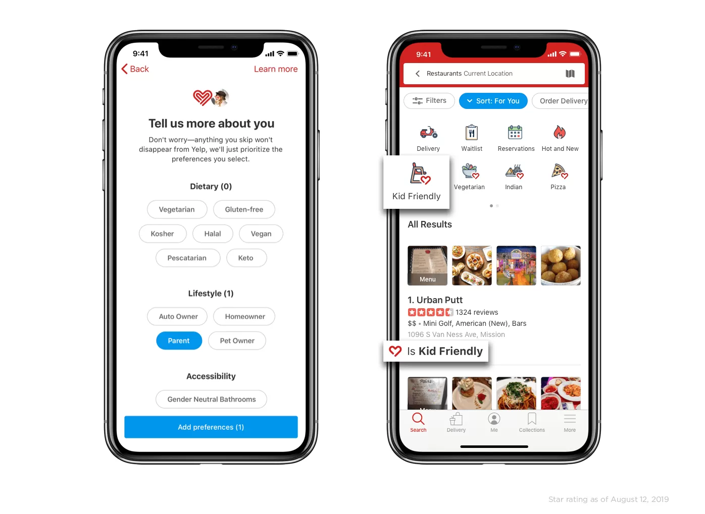
Strengths:
- Gathering users' personal preferences
- Highly versatile: from making reservations to discovering places
- Enhance a sense of participation by checking in
Our Opportunities:
- Optimize content for screen readers
- Prioritize key exploring features
- Enhance communication within the blind community
Google Map
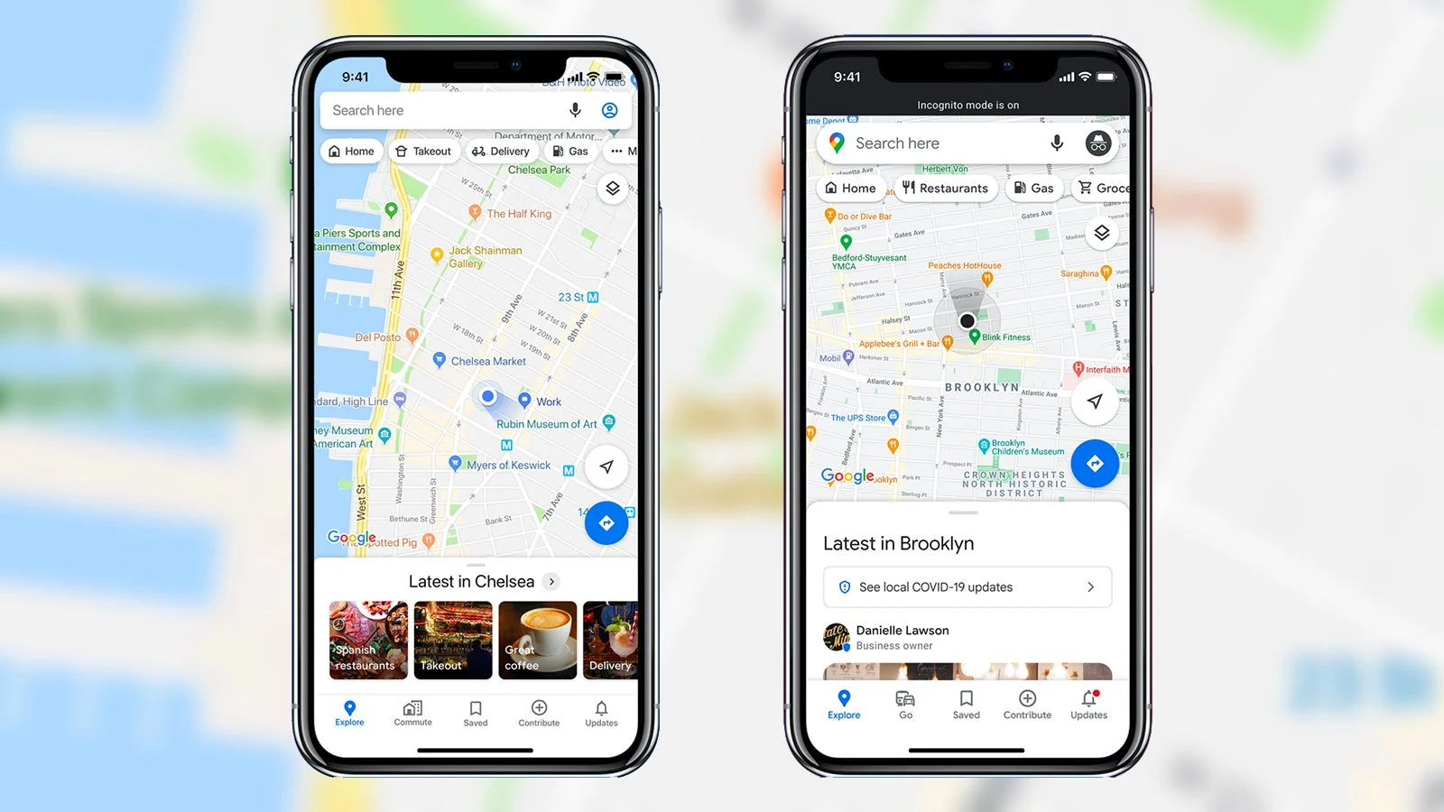
Strengths:
- Focus on navigation for the blind
- Provide vocalized information about nearby stores and places
- Create a 3D sound map for use with headphones
Our Opportunities:
- Connect people with visual impairments to the broader public
- Update the app's design for a more modern look
- Collect and analyze user preferences
Now, we know what we should design:
Optimize design for screen readers
Surface accessibility information clearly
Help users quickly identify their location
Find places of interest along usual routes
define
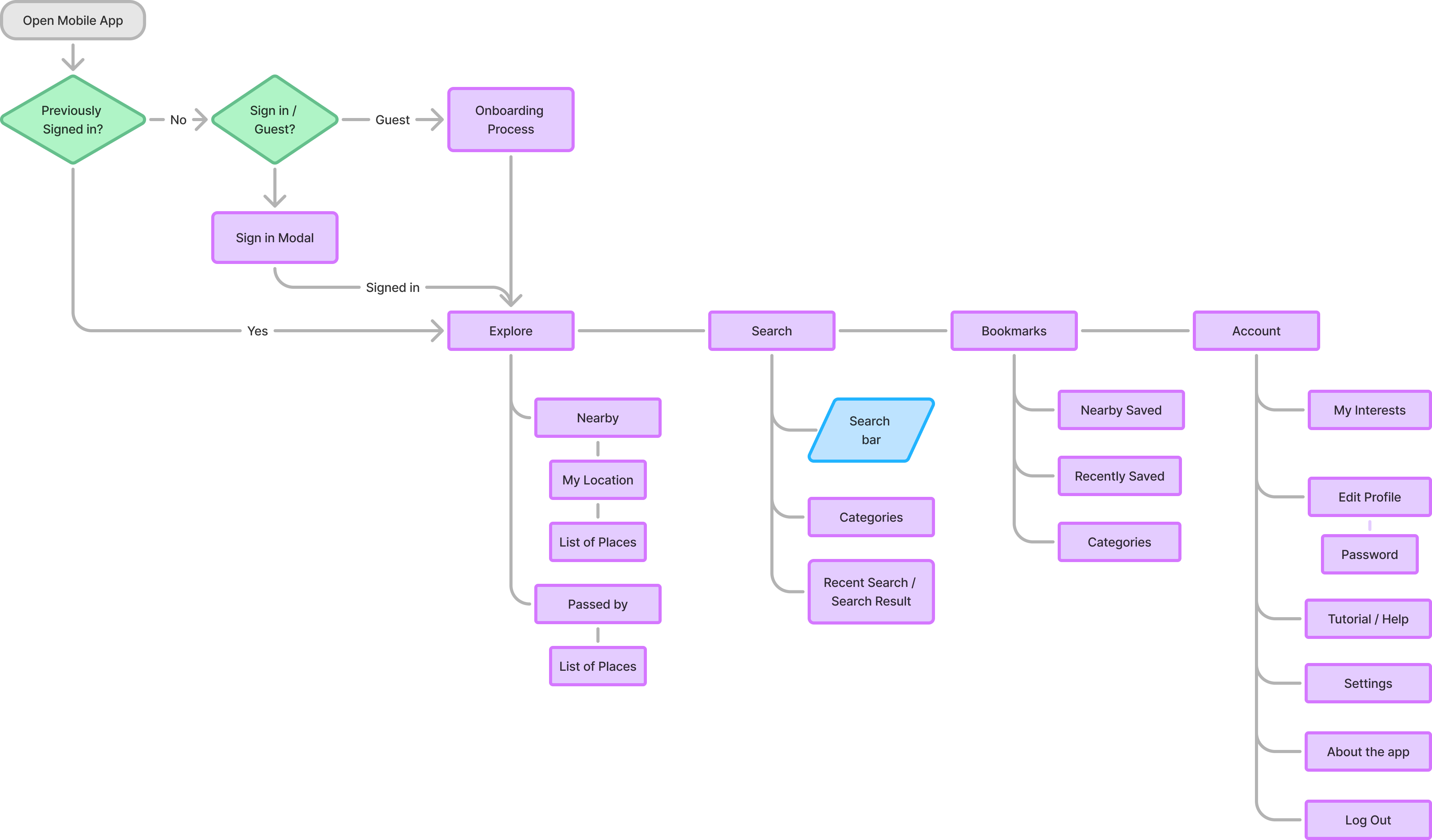
Information Archtecture
prototype
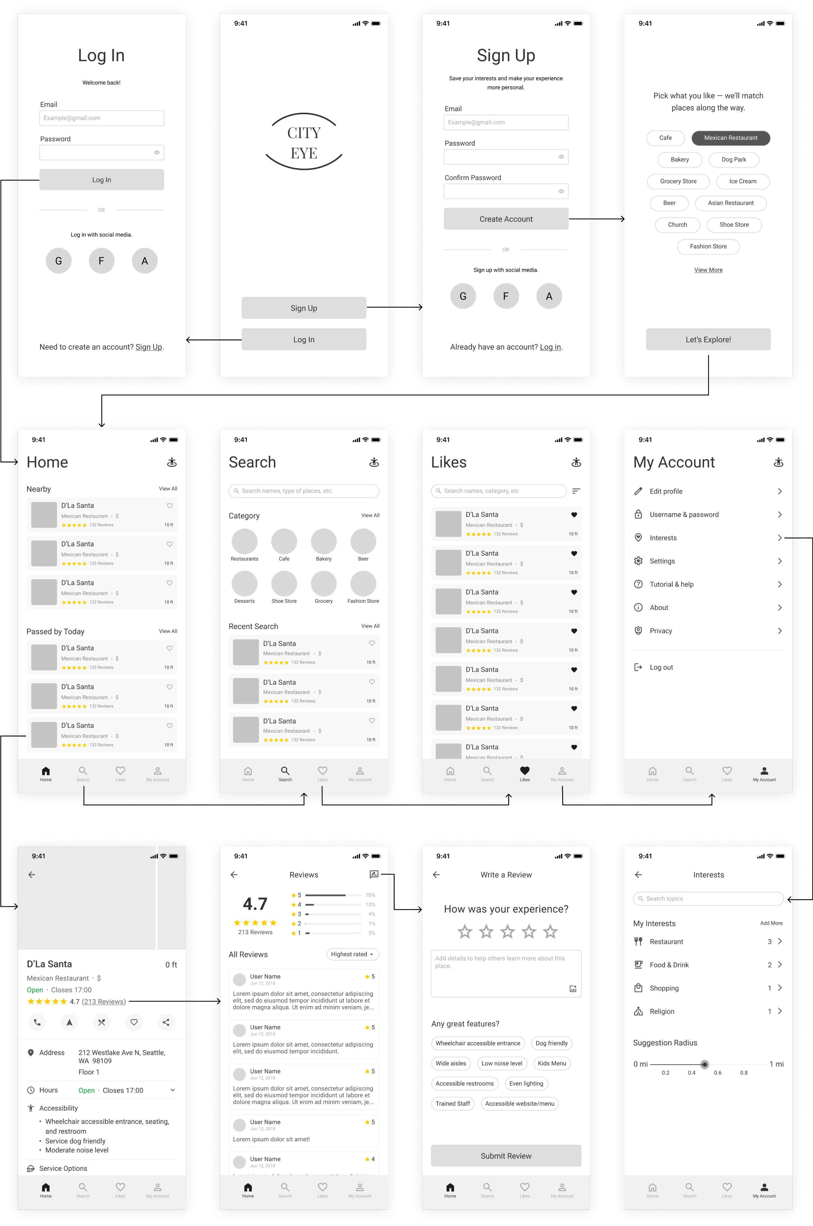
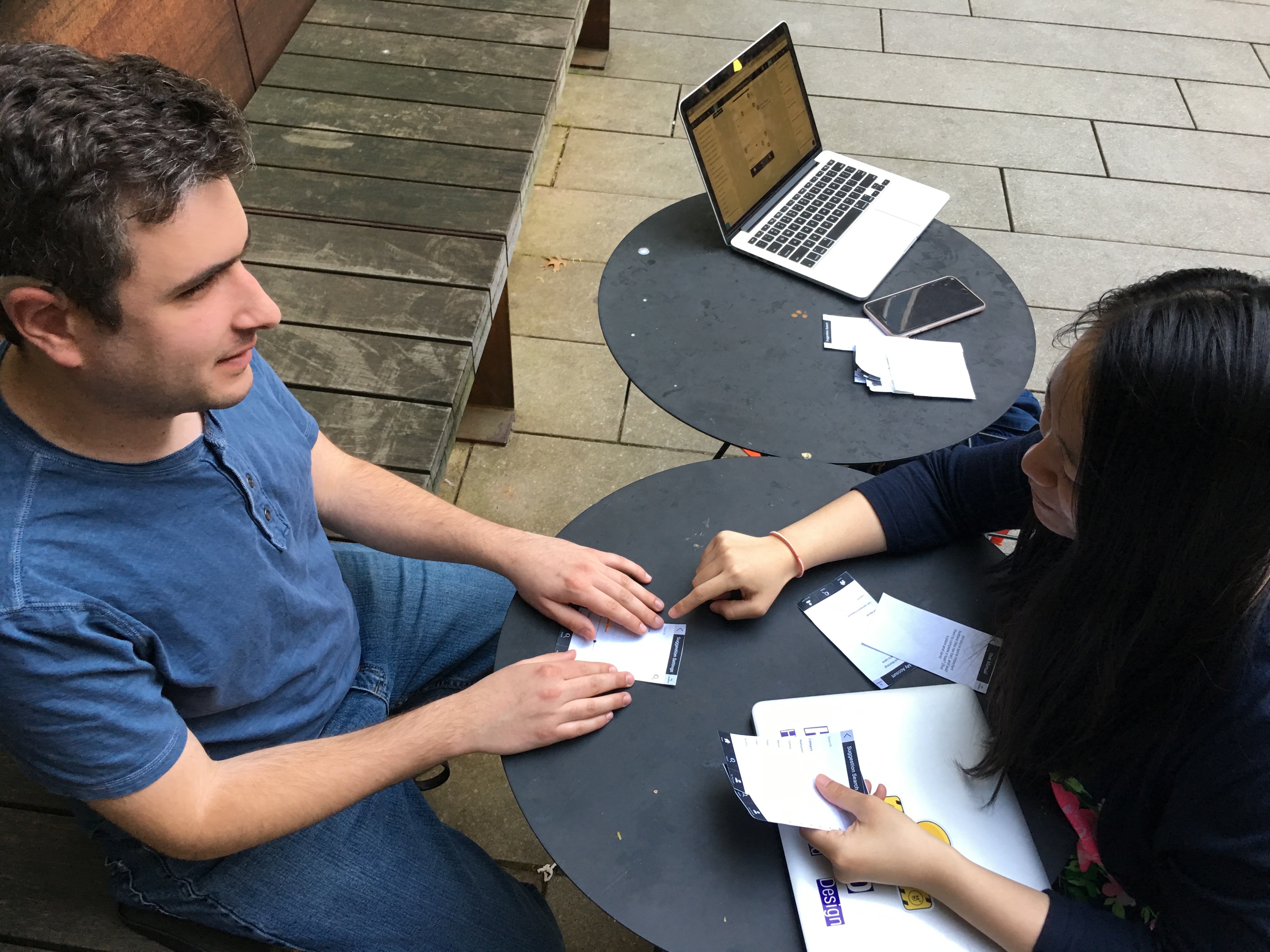
Creating Lo-fi prototypes to gather feedback from heuristic evaluation and real users.
testings
User testings and consultation with access technology experts led to key screen improvements.
Design for Screen Readers
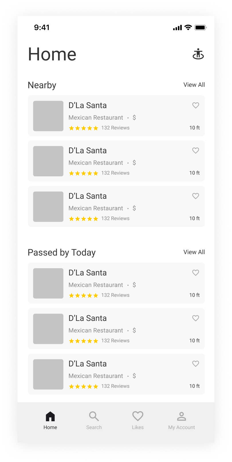
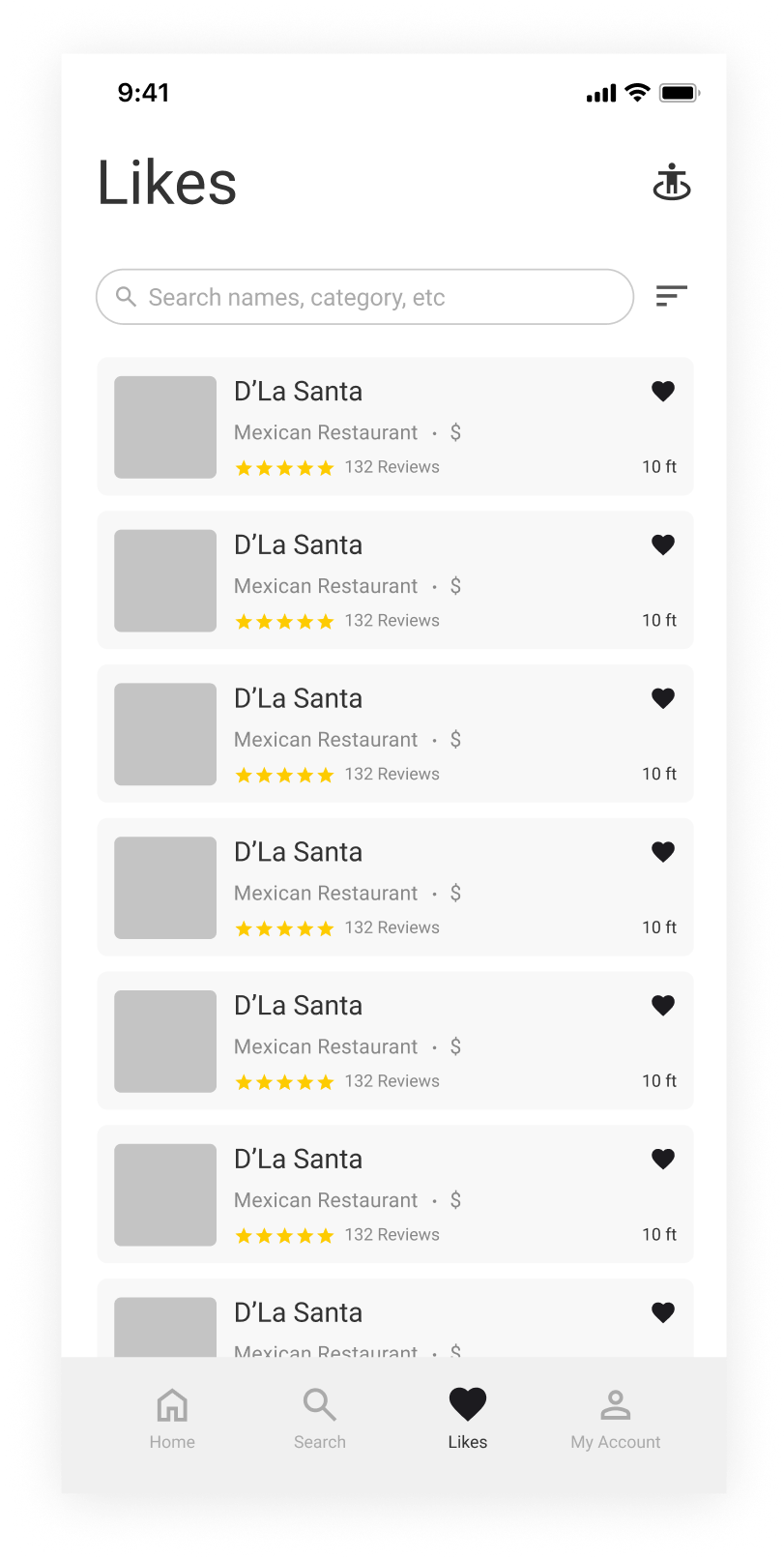
Repeatedly reading the location button on every page delays screen reader users from accessing content.
Before
Users noted they rarely revisit saved places unless they plan to share them.

It's difficult for screen reader users to navigate between sections without listening to all prior content.

Screen reader users prefer distance and hours first, but the card shows 'like' earlier.
This location button is shown on the Home page only.
After

Card layout updated to better suit screen reader users.
Move the Liked tab to the Home page as a less frequently used but important option.

Provide a few common filters to help users quickly sort places by preference.
Screen reader users can triple-tap the Home button to hear their location and direction.
By announcing 'Nearby, tab, 1 of 3,' screen readers let users switch tabs without hearing all prior content.
Easily Organize Saved Places
Users expressed a need for easier access to common filters.
Before
Relying on the search bar is challenging for screen reader users.
With many saved places, users want to organize them into lists.
Users indicated a need for features like deleting, reorganizing, and creating new lists.
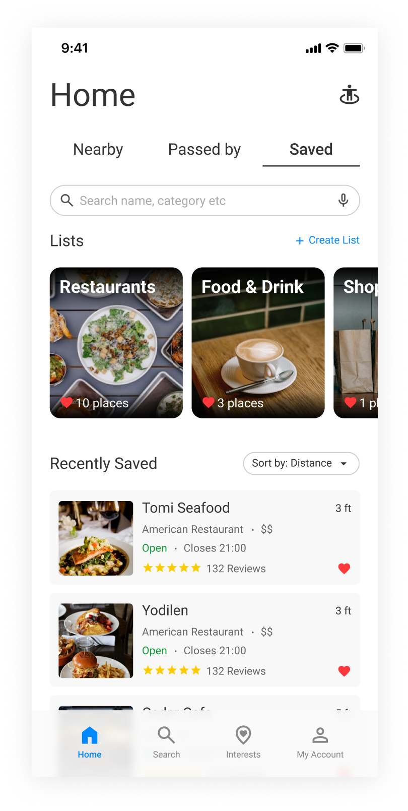
After
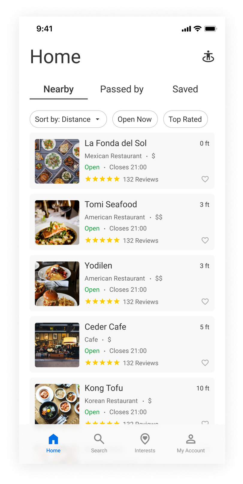
Improve visibility of sorting method and enable quick sort adjustments.

Voice input in the search bar allows some users to enter text more smoothly.
When Home is already selected, tapping it again takes you back to the Nearby tab.
Places are auto-saved to a relevant list by default, with the option to create custom lists.

Personalize Experience Fast
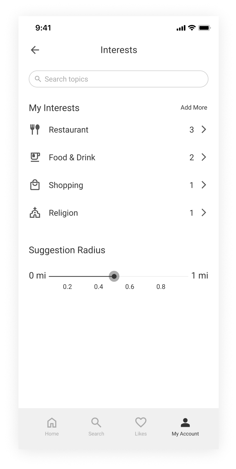
This button may open a new page, making it easy to lose track of for blind users.
Before
Users must click a category to view specific interests, which can be burdensome.
There’s no easy way for users to add interests before browsing many options.
Overestimate how much blind or low-vision users are willing to deviate from their usual path.
After
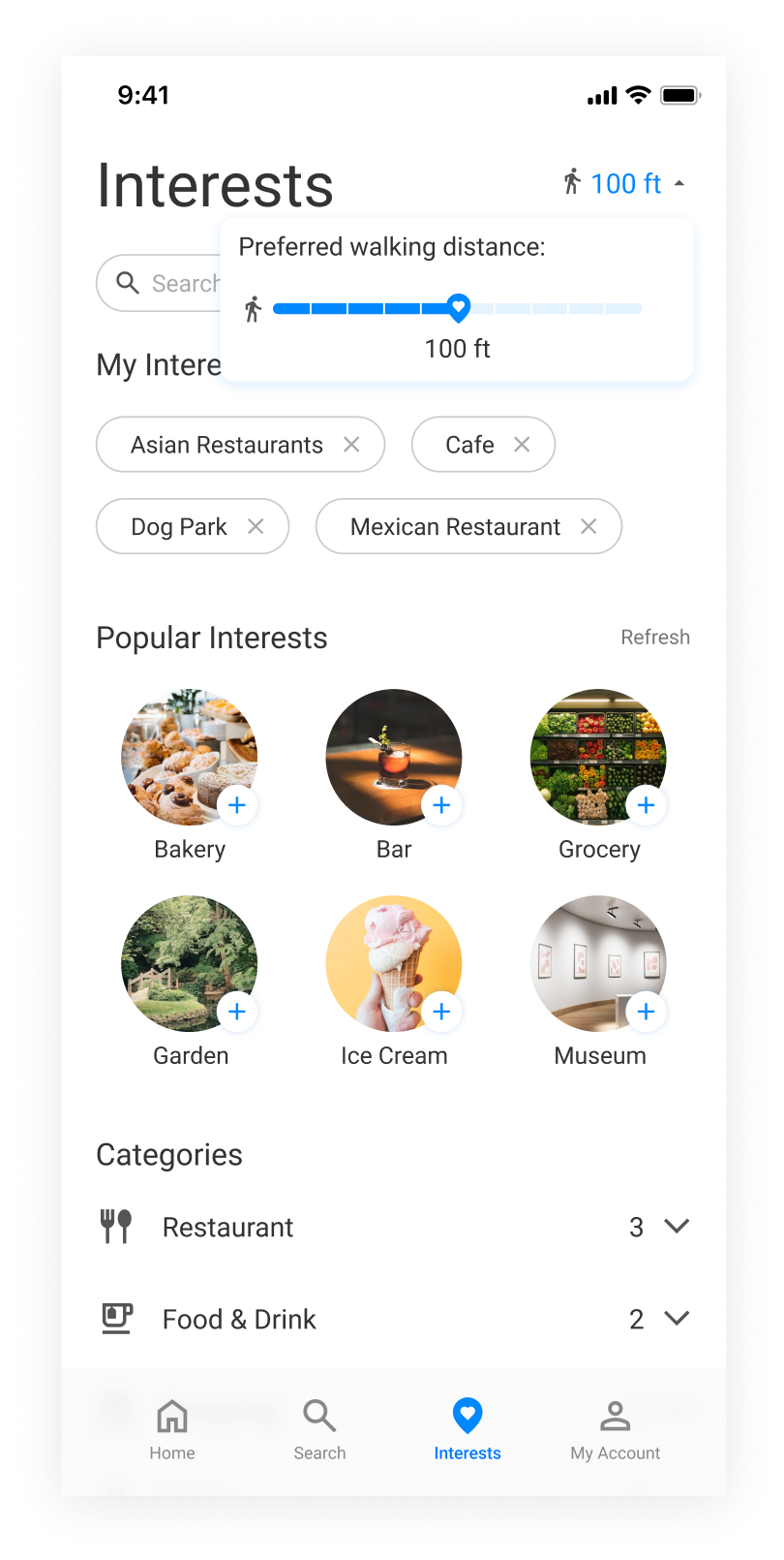
Users requested a quick way to add some popular interests.

Reduce the range to match the detour distance blind users prefer.
Users can still view the full list of interests if desired.

Users can quickly see and edit the interests here.
Let users manage interests quickly without going through My Account.

final design
In the final design, we also ensured the app supports invert color for low-vision users.
results
We won the top prize, “People’s Choice,” competing against 20+ projects at the UW HCDE open house.
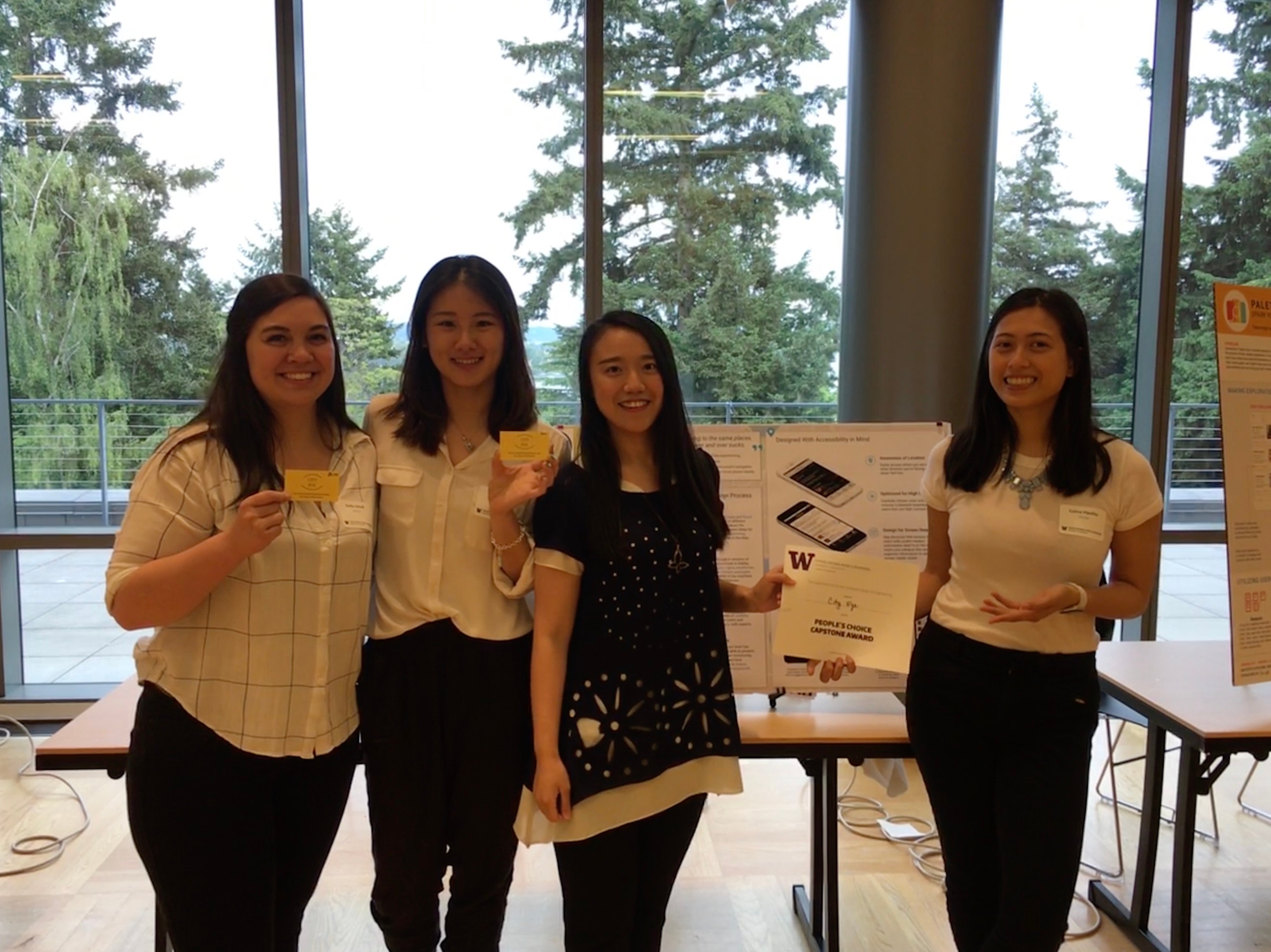
200+ participants voted for us and shared their most heartfelt praise.
REFELECTIONS
Designs should be inclusive—blind, low vision, or normal vision users all deserve a great app.
It's challenging to optimize layouts for screen readers and explain to devs how each element should be announced.

Check out more projects
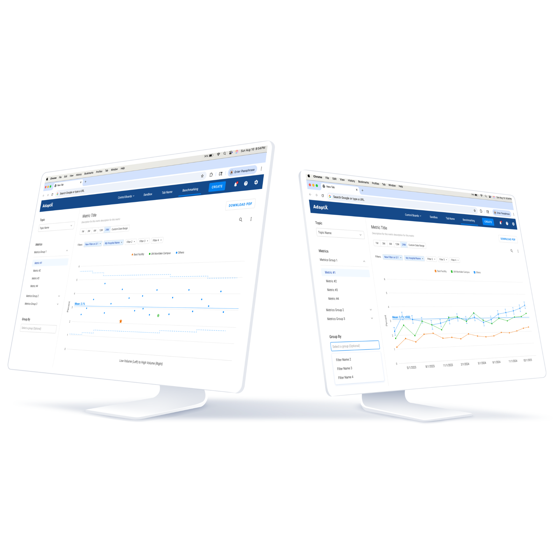
Healthcare Benchmarking Tool That Raised Renewals
Designed a intuitive system that drove 70% contract renewals and converted 66% of hesitant clients.
View More →

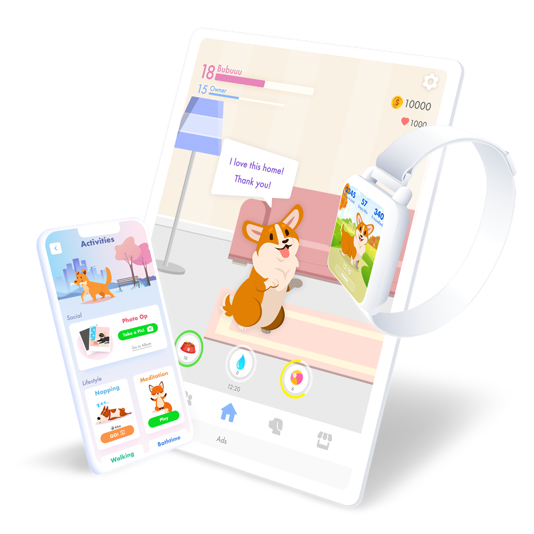
Boosting User Retention and Revenue for a Game
Defined product strategy alongside the PM, resulting in a 113% growth in ARPDAU and a 28% in D1 retention
View More →
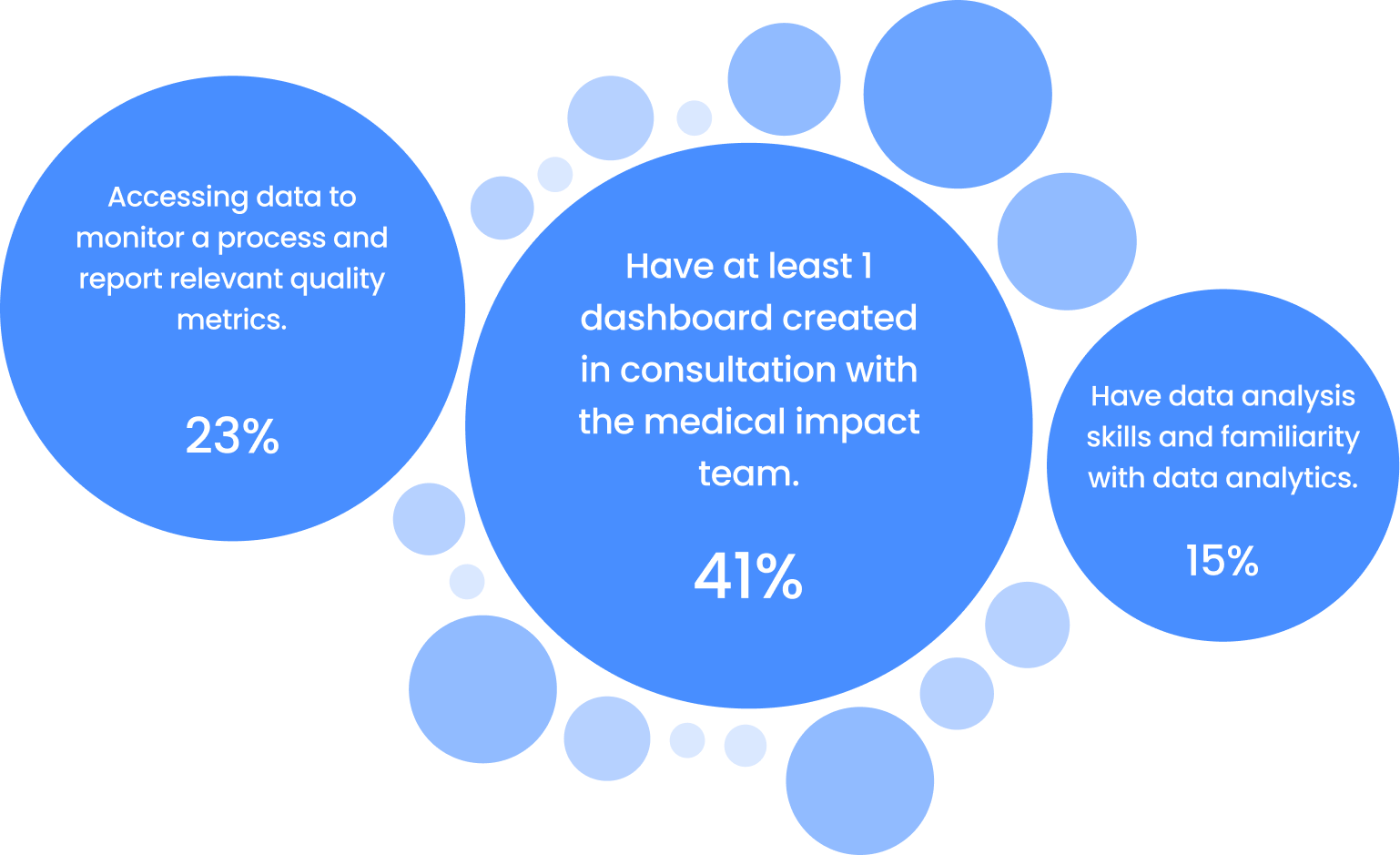
Enhanced Engagement and Reduced Drop-off Rate
Redesigned onboarding UX and drove a 73% boost in weekly active users and cut D1 drop-off by 68%.
View More →

“Going to the same place over and over sucks.”
From a blind participant
HOW IT STARTS
Everyone deserves to explore the world — including those who are visually impaired.
Our goal is to help legally blind individuals navigate comfortably. With a 4-month timeline, we narrowed our focus from broad navigation to specifically enhancing the EXPLORE experience.
RESEARCH
Use focus groups to uncover obstacles individuals face when exploring unfamiliar places.
At the start, we had limited insight into the challenges blind individuals face exploring new places, so we held focus groups with 8+ legally blind participants.
We gathered diverse perspectives as participants felt more at ease sharing their experiences in a relaxed group setting.
We identified 3 key insights that could inform potential solutions within our scope.
We gathered valuable insights but focused on the 3 most critical issues within our scope and resources to develop actionable solutions.
“I’m afraid of getting lost in unfamiliar places”
Participants expressed concerns about unclear directions, unfamiliar traffic conditions, safety issues, and uncertainty about whether they have arrived.
“I’m not aware of the stores along my usual route”
Participants can’t quickly scan nearby stores as individuals with normal vision can, nor can they manually browse each store on a map while walking.
“I’m not sure if the new place is accessible for me”
Providing feedback with accessibility details is crucial—such as noting wheelchair ramps, adequate lighting, dog friendly, or the presence of a Braille menu.
Why do they still have these problems with existing technology?

I conducted competitive analysis to assess the limitations and identify potential opportunities.
I summarized the technologies and apps frequently mentioned in the focus group interviews. By comparing, I can identified opportunities to address the problems differently.
Soundscape
Strengths:
- Focus on navigation for the blind
- Provide vocalized information about nearby stores and places
- Create a 3D sound map for use with headphones
Our Opportunities:
- Connect people with visual impairments to the broader public
- Update the app's design for a more modern look
- Collect and analyze user preferences
Yelp
Strengths:
- Gathering users' personal preferences
- Highly versatile: from making reservations to discovering places
- Enhance a sense of participation by checking in
Our Opportunities:
- Optimize content for screen readers
- Prioritize key exploring features
- Enhance communication within the blind community
Google Map
Strengths:
- Focus on navigation for the blind
- Provide vocalized information about nearby stores and places
- Create a 3D sound map for use with headphones
Our Opportunities:
- Connect people with visual impairments to the broader public
- Update the app's design for a more modern look
- Collect and analyze user preferences
Now, we know what we should design:
Optimize design for screen readers
Surface accessibility information clearly
Help users quickly identify their location
Find places of interest along usual routes
define
Information Archtecture
After having key features in mind, IA provides a clear navigation framework for us and guides design decisions by defining how information should be presented and accessed.
prototype
Creating Lo-fi prototypes to gather feedback from heuristic evaluation and real users.
Lo-fi prototypes help us learn whether our designs are heading in the right direction before investing more effort. Heuristic evaluations also help assess if our designs align with established design principles.
testings
User testings and consultation with access technology experts led to key screen improvements.
User testing with blind and deaf participants reveals their preferences and abilities, while sessions with assistive tech experts enhance our understanding of screen readers and effective content presentation for blind users.
Optimizing Layouts for Screen Readers
Repeatedly reading the location button on every page delays screen reader users from accessing content.
Before
Users noted they rarely revisit saved places unless they plan to share them.

It's difficult for screen reader users to navigate between sections without listening to all prior content.

Screen reader users prefer distance and hours first, but the card shows 'like' earlier.
This location button is shown on the Home page only.
After

Card layout updated to better suit screen reader users.
Move the Liked tab to the Home page as a less frequently used but important option.

Provide a few common filters to help users quickly sort places by preference.
Screen reader users can triple-tap the Home button to hear their location and direction.
By announcing 'Nearby, tab, 1 of 3,' screen readers let users switch tabs without hearing all prior content.
Easily Filter and Organize Saved Places
Users expressed a need for easier access to common filters.
Before
Relying on the search bar is challenging for screen reader users.
With many saved places, users want to organize them into lists.
Users indicated a need for features like deleting, reorganizing, and creating new lists.
After
Improve visibility of sorting method and enable quick sort adjustments.

Voice input in the search bar allows some users to enter text more smoothly.
When Home is already selected, tapping it again takes you back to the Nearby tab.
Places are auto-saved to a relevant list by default, with the option to create custom lists.

Let Users Tailor Their Experience Fast
This button may open a new page, making it easy to lose track of for blind users.
Before
Users must click a category to view specific interests, which can be burdensome.
There’s no easy way for users to add interests before browsing many options.
Overestimate how much blind or low-vision users are willing to deviate from their usual path.
After
Users requested a quick way to add some popular interests.

Reduce the range to match the detour distance blind users prefer.
Users can still view the full list of interests if desired.

Users can quickly see and edit the interests here.

Let users manage interests quickly without going through My Account.

final design
In the final design, we also ensured the app supports invert color for low-vision users.
We were surprised by how much low-vision users rely on high-contrast text, reduced animation, clear notifications, and the invert color feature—our designs now reflect how much we value these needs.
results
We won the top prize, “People’s Choice,” competing against 20+ projects at the UW HCDE open house.
We’re proud to showcase accessibility design and highlight the value of inclusivity to a wider audience.
200+ participants voted for us and shared their most heartfelt praise.
REFELECTIONS
Designs should be inclusive—blind, low vision, or normal vision users all deserve a great app.
When designing, we should consider not just aesthetics, but also screen reader interpretation, inverted color display, and efficient information presentation.
It's challenging to optimize layouts for screen readers and explain to devs how each element should be announced.
Currently, no design tools support screen reader prototyping without coding, making user testing difficult and requiring extra-detailed handoffs to devs.
It's also hard to fully understand screen reader users' habits without being part of their community.

Check out more projects
Healthcare Benchmarking Tool That Raised Renewals
Designed a intuitive system that drove 70% of users with this feature renewed contracts, and 66% of hesitant clients were converted.
View More →
Boosting User Retention and Revenue for a Game
Defined product strategy alongside the PM, resulting in a 113% growth in ARPDAU and a 28% in D1 retention
View More →
Enhanced Engagement and Reduced Drop-off Rate
Redesigned onboarding UX and drove a 73% boost in weekly active users and cut D1 drop-off by 68%.
View More →

“Going to the same place over and over sucks.”
From a blind participant
HOW IT STARTS
Everyone deserves to explore the world — including those who are visually impaired.
Our goal is to help legally blind individuals navigate comfortably. With a 4-month timeline, we narrowed our focus from broad navigation to specifically enhancing the EXPLORE experience.
RESEARCH
Use focus groups to uncover obstacles individuals face when exploring unfamiliar places.
At the start, we had limited insight into the challenges blind individuals face exploring new places, so we held focus groups with 8+ legally blind participants.
We gathered diverse perspectives as participants felt more at ease sharing their experiences in a relaxed group setting.
We identified 3 key insights that could inform potential solutions within our scope.
We gathered valuable insights but focused on the 3 most critical issues within our scope and resources to develop actionable solutions.
“I’m afraid of getting lost in unfamiliar places”
Participants expressed concerns about unclear directions, unfamiliar traffic conditions, safety issues, and uncertainty about whether they have arrived.
“I’m not aware of the stores along my usual route”
Participants can’t quickly scan nearby stores as individuals with normal vision can, nor can they manually browse each store on a map while walking.
“I’m not sure if the new place is accessible for me”
Providing feedback that includes details on accessibility aspects is crucial, such as whether a location has a wheelchair ramp or has Braille menu.
Why do they still have these problems with existing technology?
I conducted competitive analysis to assess the limitations and identify potential opportunities.
I summarized the technologies and apps frequently mentioned in the focus group interviews. By comparing, I can identified opportunities to address the problems differently.
Soundscape
Strengths:
- Focus on navigation for the blind
- Provide vocalized information about nearby stores and places
- Create a 3D sound map for use with headphones
Our Opportunities:
- Connect people with visual impairments to the broader public
- Update the app's design for a more modern look
- Collect and analyze user preferences
Yelp
Strengths:
- Gathering users' personal preferences
- Highly versatile: from making reservations to discovering places
- Enhance a sense of participation by checking in
Our Opportunities:
- Optimize content for screen readers
- Prioritize key exploring features
- Enhance communication within the blind community
Google Map
Strengths:
- Focus on navigation for the blind
- Provide vocalized information about nearby stores and places
- Create a 3D sound map for use with headphones
Our Opportunities:
- Connect people with visual impairments to the broader public
- Update the app's design for a more modern look
- Collect and analyze user preferences
Now, we know what we should design:
Optimize design for screen readers
Surface accessibility information clearly
Help users quickly identify their location
Find places of interest along usual routes
define
Use Information Architecture to define what we present in the app and how we present it.
After having key features in mind, IA provides a clear navigation framework for us and guides design decisions by defining how information should be presented and accessed.
prototype
Creating Lo-fi prototypes to gather feedback from heuristic evaluation and real users.
Lo-fi prototypes help us learn whether our designs are heading in the right direction before investing more effort. Heuristic evaluations also help assess if our designs align with established design principles.
testings
User testings and consultation with access technology experts led to key screen improvements.
User testing with blind and deaf participants reveals their preferences and abilities, while sessions with assistive tech experts enhance our understanding of screen readers and effective content presentation for blind users.
Optimizing Layouts for Screen Readers
Repeatedly reading the location button on every page delays screen reader users from accessing content.
Before
Users noted they rarely revisit saved places unless they plan to share them.

It's difficult for screen reader users to navigate between sections without listening to all prior content.

Screen reader users prefer distance and hours first, but the card shows 'like' earlier.
This location button is shown on the Home page only.
After

Card layout updated to better suit screen reader users.
Move the Liked tab to the Home page as a less frequently used but important option.

Provide a few common filters to help users quickly sort places by preference.
Screen reader users can triple-tap the Home button to hear their location and direction.
By announcing 'Nearby, tab, 1 of 3,' screen readers let users switch tabs without hearing all prior content.
Easily Filter and Organize Saved Places
Users expressed a need for easier access to common filters.
Before
Relying on the search bar is challenging for screen reader users.
With many saved places, users want to organize them into lists.
Users indicated a need for features like deleting, reorganizing, and creating new lists.
After
Improve visibility of sorting method and enable quick sort adjustments.

Voice input in the search bar allows some users to enter text more smoothly.
When Home is already selected, tapping it again takes you back to the Nearby tab.
Places are auto-saved to a relevant list by default, with the option to create custom lists.

Let Users Tailor Their Experience Fast
This button may open a new page, making it easy to lose track of for blind users.
Before
Users must click a category to view specific interests, which can be burdensome.
There’s no easy way for users to add interests before browsing many options.
Overestimate how much blind or low-vision users are willing to deviate from their usual path.
After
Users requested a quick way to add some popular interests.

Reduce the range to match the detour distance blind users prefer.
Users can still view the full list of interests if desired.

Users can quickly see and edit the interests here.

Let users manage interests quickly without going through My Account.
final design
In the final design, we also ensured the app supports invert color for low-vision users.
We were surprised by how much low-vision users rely on high-contrast text, reduced animation, clear notifications, and the invert color feature—our designs now reflect how much we value these needs.
results
We won the top prize, “People’s Choice,” competing against 20+ projects at the UW HCDE open house.
We’re proud to showcase accessibility design and highlight the value of inclusivity to a wider audience.
200+ participants voted for us and shared their most heartfelt praise.
REFELECTIONS
Designs should be inclusive—blind, low vision, or normal vision users all deserve a great app.
When designing, we should consider not just aesthetics, but also screen reader interpretation, inverted color display, and efficient information presentation.
It's challenging to optimize layouts for screen readers and explain to devs how each element should be announced.
Currently, no design tools support screen reader prototyping without coding, making user testing difficult and requiring extra-detailed handoffs to devs.
It's also hard to fully understand screen reader users' habits without being part of their community.

Check out more projects
Healthcare Benchmarking Tool That Raised Renewals
70% of users with this feature renewed contracts, and 66% of hesitant clients were converted.
View More →
Boosting User Retention and Revenue for a Game
Defined product strategy alongside the PM, resulting in a 113% growth in ARPDAU and a 28% in D1 retention
View More →
Enhanced Engagement and Reduced Drop-off Rate
Redesigned onboarding UX and drove a 73% boost in weekly active users and cut D1 drop-off by 68%.
View More →